PRIVATE CONTENT
CenterPoint Energy
Senior UX Designer
Angular Code and Figma
1+ Year
The team consisted of 1 Senior Designer (myself), 1 Product Manager, 1 Product Owner, 5 Developers, and 1 QA
Challenge
CenterPoint’s internal products were visually inconsistent, relying on the default PrimeNG design system. This caused friction in handoffs, redundancy across teams, and accessibility issues. Colors didn’t meet ADA contrast ratios, spacing was inconsistent, and teams frequently reinvented components.
Inconsistent UI patterns across tools caused user confusion and extra QA work.
Designers and devs used ad hoc styles with no shared tokens or documentation.
Previous color palette failed ADA compliance (e.g. #0099D8 didn’t meet contrast).
Lack of theming slowed down updates and introduced inconsistencies between apps.
I led the evolution of CenterPoint Energy’s design system, adapting the PrimeNG component library into a scalable, accessible framework. The goal was to unify branding across internal applications, enhance accessibility, and enable designers to ship faster without sacrificing consistency. I defined new tokens, standardized component specs, and created extensible patterns to support multiple teams.
System Audit & Analysis:
We reviewed existing UI patterns across applications and identified inconsistencies in spacing, font use, and accessibility. We also benchmarked against WCAG 2.1 for compliance.
Token Architecture & Foundations:
We created a unified 4pt spacing scale, semantic color tokens, and a new Inter-based typography system. These were the foundation for scalable theming and design consistency.
Component Library & Expansion:
We rebuilt PrimeNG components using our new tokens and extended the system with net-new components based on team needs. One-offs were handled through local designer support.
Accessibility & Visual Consistency:
We replaced non-accessible brand colors, created visual rules for icon contrast and text legibility, and ensured our components passed contrast checks across all use cases.
Team Enablement & Documentation:
We documented everything directly in Figma, onboarded new designers, and worked closely with developers to maintain 1:1 parity with implementation. This ensured adoption and long-term scalability.
Results & Reflection:
The system improved UI consistency across teams, reduced redundant component creation, and accelerated design-to-dev workflows through clearer standards and token usage.
Vendor Constraints: PrimeNG was the base, which meant we had to work within its theming system.
Audit Process: I audited all existing internal applications and cataloged common UI patterns, inconsistencies, and accessibility issues.
Design Alignment: I worked across multiple product teams to identify what was working, what needed replacement, and which patterns were universal.
Spacing: Introduced a 4pt spacing scale to replace PrimeNG’s looser defaults.
Typography: Defined a type system around Inter with clear hierarchy: headings, body text, captions.
Colors: Replaced non-ADA-compliant logo blue with an accessible primary blue (#2563EB) and introduced semantic tokens (e.g., color-primary, color-muted, color-surface) to future-proof theming.
Component Radii: Standardized to 4px for small, 8px for default, and 12px for cards, giving hierarchy while maintaining visual simplicity.
This visual outlines the hierarchy from primitive tokens (like raw values) to semantic and component-specific tokens across light and dark modes. This structure enabled scalable theming, consistent UI application, and seamless developer integration across all platforms.

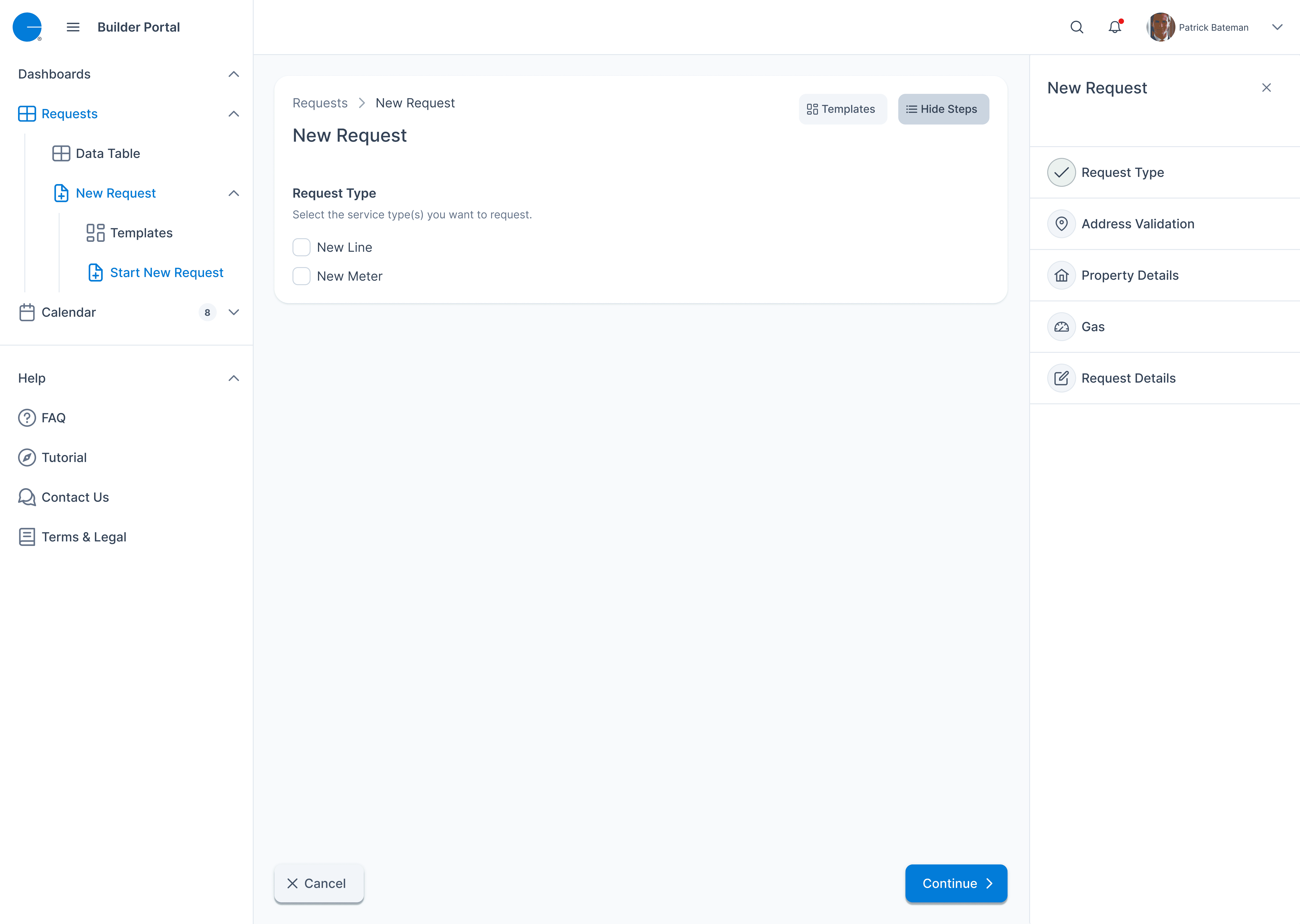
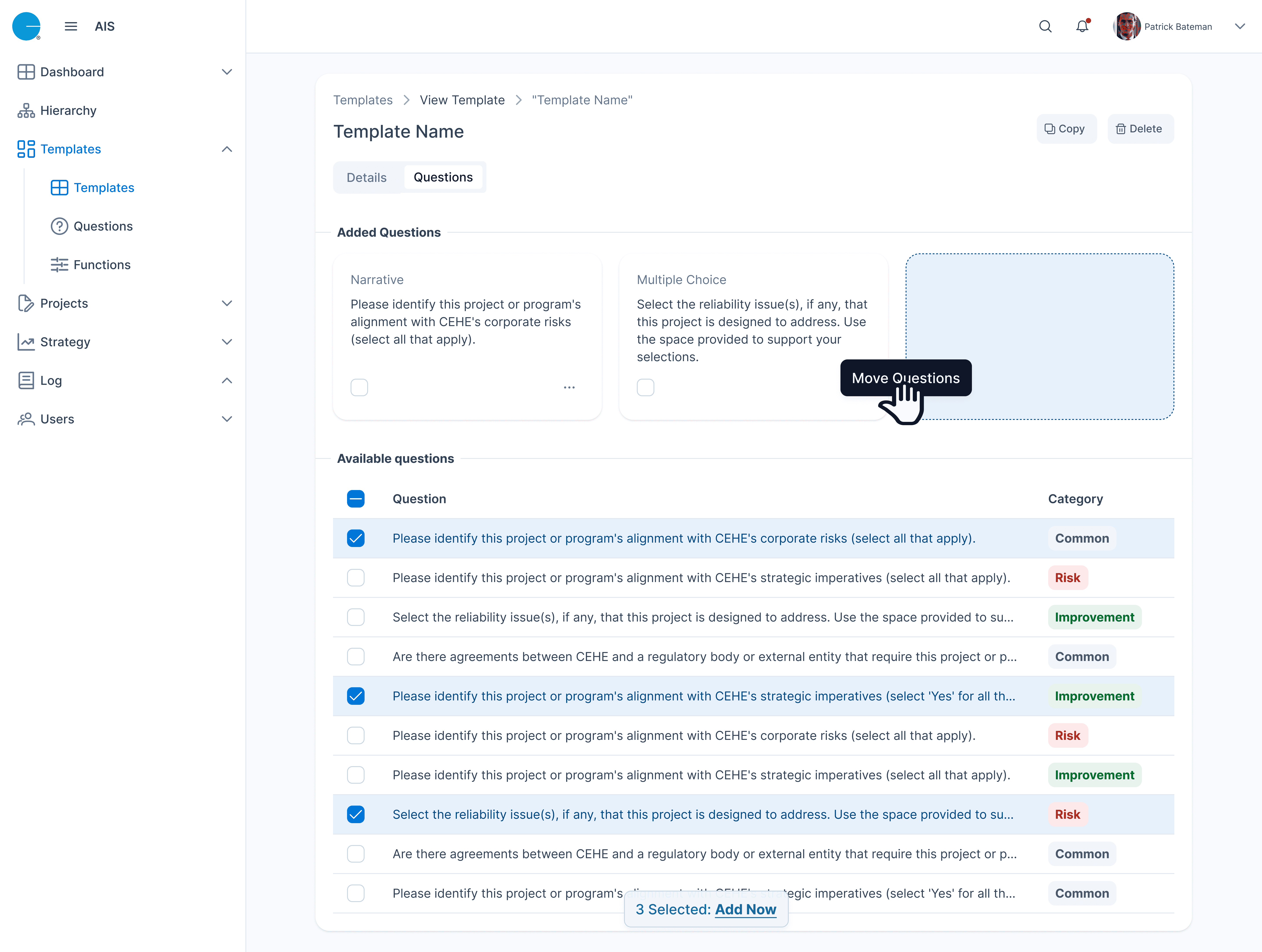
Component Library: Extended PrimeNG with over a dozen additional custom components based on team requests (e.g., stepper, status badge, empty states).
Multi-use Support: Each component was created as a flexible variant and documented to guide implementation across products.
1-off Requests: For non-scalable components, I worked directly with designers to maintain brand alignment without bloating the system.
As the design system matured, adoption became just as critical as construction. A scalable system is only useful if designers and developers know how to use it confidently. I focused on creating thorough documentation and fostering a shared understanding across teams.
I built documentation directly in Figma using component tooltips, usage guidelines, and naming conventions that matched developer terminology. I also created visual examples for things like hover states, spacing, and semantic color usage to minimize ambiguity.
To encourage adoption:
I held onboarding sessions with new designers to walk through the system’s logic and show how to use and extend tokens.
I worked closely with dev leads to ensure every token and component had a one-to-one match in the PrimeNG implementation.
When teams needed unique one-off components, I supported them by designing consistent variants and setting expectations on what would and wouldn’t be added to the system.
This step ensured the system wasn’t just a library—it became a foundation for faster, more accessible, and more consistent product development across CenterPoint Energy’s internal tools.
The design system reduced duplicate component creation by 60% across teams.
Accessibility scores improved across all audited apps, with color contrast ratios now compliant.
Developer handoffs were faster due to standardized specs, spacing tokens, and clear documentation.
Building this design system pushed me to think far beyond individual screens — it was about enabling scalable, consistent experiences across multiple products. One of the biggest challenges was balancing the rigid structure of PrimeNG with the flexibility our teams needed. I worked closely with engineers to map tokens directly to Angular components and supported designers by building both reusable components and one-off solutions with clear guardrails.
This experience deepened my appreciation for systems thinking, accessibility, and the power of cross-functional collaboration. It also taught me how to lead with structure — creating design tokens, patterns, and documentation that empowered others to move faster without sacrificing brand or quality.


