PRIVATE CONTENT

CenterPoint Energy
Lead UX Designer
Responsive Web
1+ Year
The team consisted of 1 Senior Designer (myself), a Junior Designer, 1 Product Manager, 1 Product Owner, 5 Developers, 1 QA and 1 Business Analyst.
Challenge
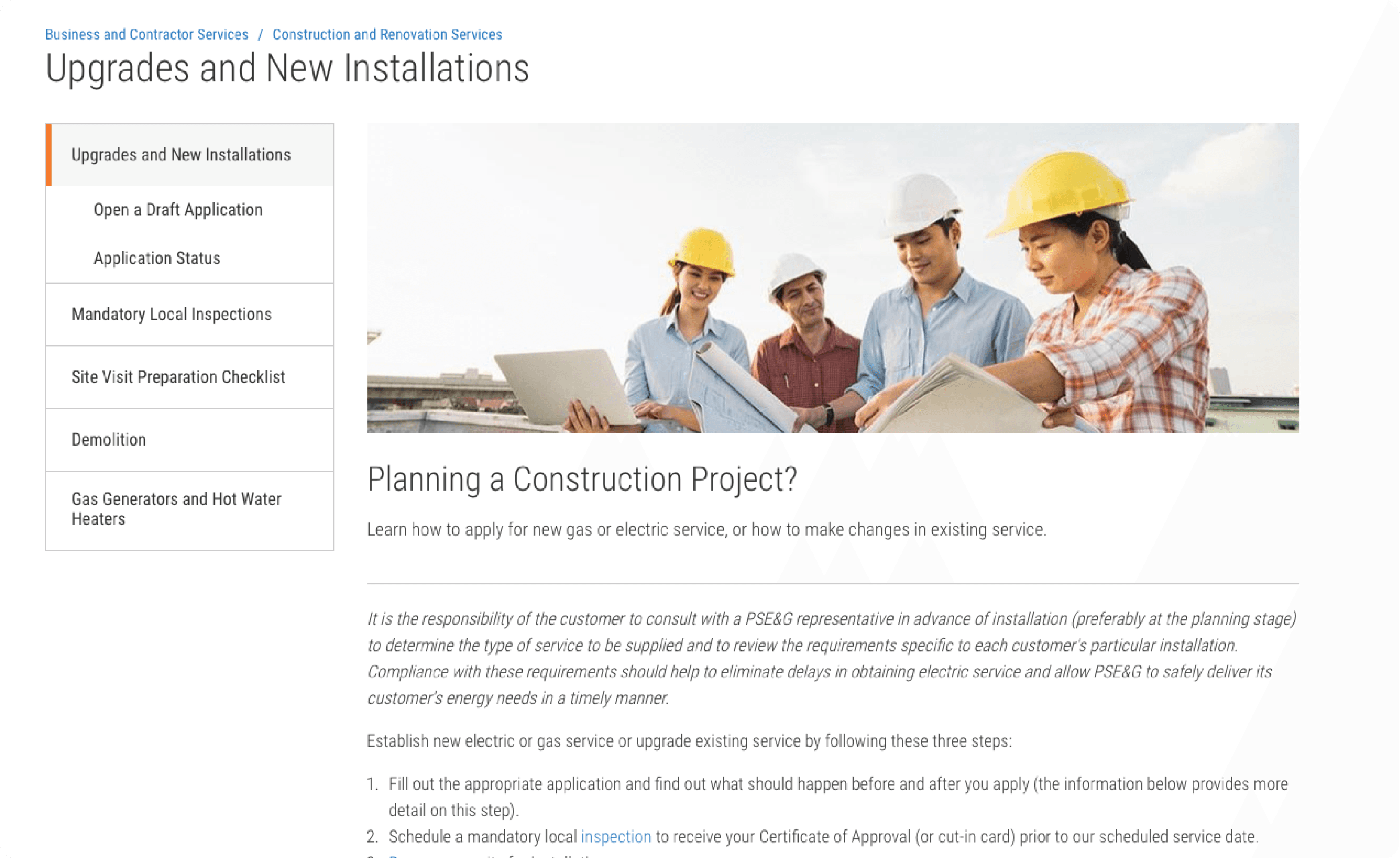
Contractors used a single form to request service work across multiple states — but each region had different rules, requirements, and contact points. Internal teams struggled to process these requests quickly, often resorting to manual sorting via spreadsheets. Scheduling was handled through disconnected systems, and builders frequently submitted incomplete or incorrect requests, resulting in delays and back-and-forth emails. There was no way for internal teams to triage or monitor request flow.
The lack of segmentation, feedback, and internal tooling created:
High error rates
Poor user satisfaction
Inefficiency for both customers and internal schedulers
The Builder Portal was a one-size-fits-all form used by external contractors to request gas or electric services. It failed to support regional rules, created confusion for builders, and offered no internal tools for scheduling or triage. I led a complete UX overhaul that introduced segmented request flows, an internal calendar view, a triage dashboard, and an FAQ system. The redesign reduced submission errors by 40%, cut support tickets by 30%, and improved scheduling coordination across 5 states.

Discovery & Competitive Analysis:
We conducted a competitive analysis of other utility builder portals and identified key features that streamlined the request process. This helped uncover gaps in our own flow and shaped early hypotheses.
User Interviews & Research:
We interviewed both internal scheduling agents and external contractors to understand their workflows, pain points, and expectations from the portal. This revealed core usability issues and lack of contextual guidance.
User Flows & Information Architecture:
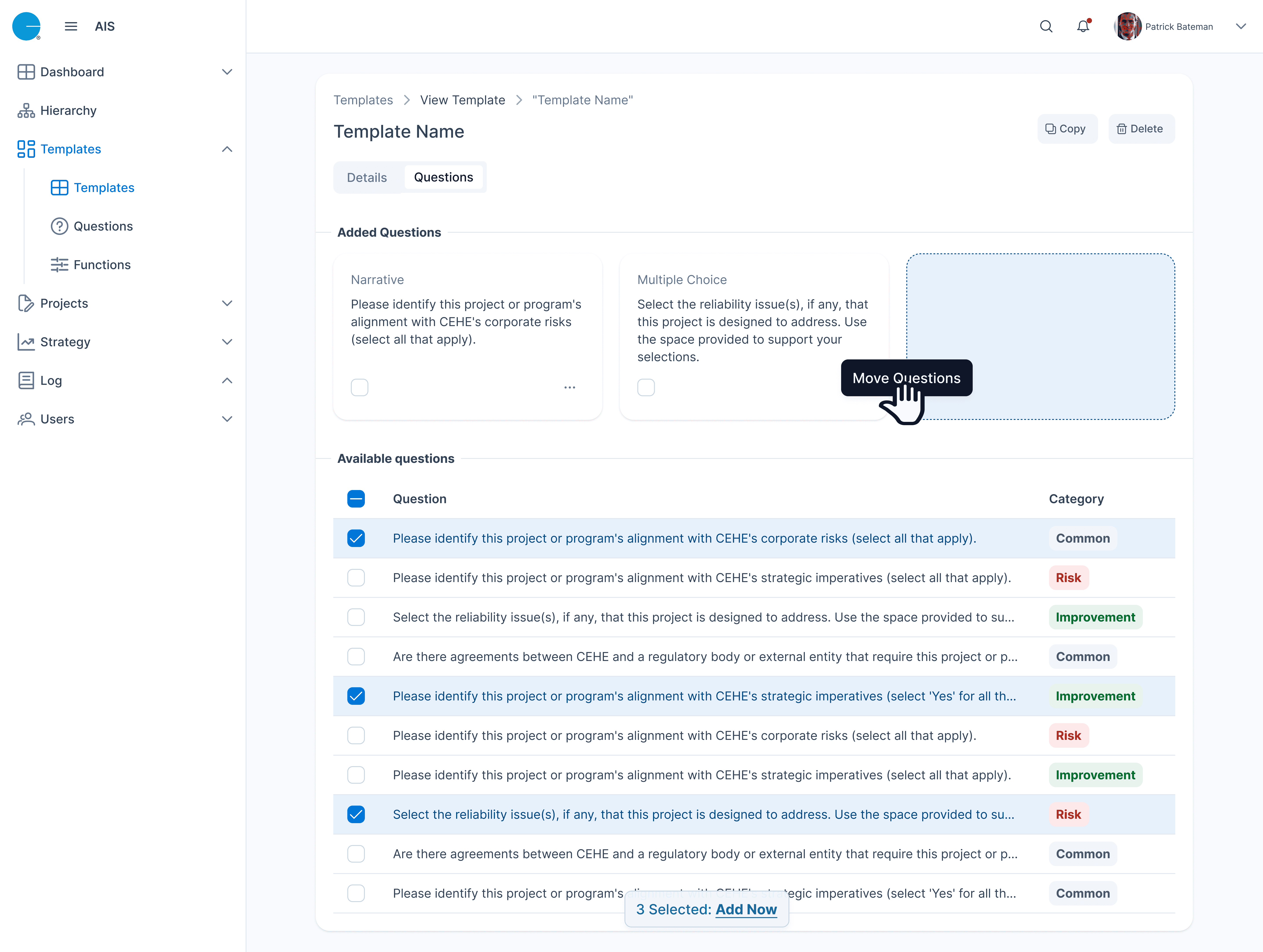
Based on user feedback and business requirements, we restructured the experience into segmented flows. We also introduced a dashboard for internal users to triage requests and manage scheduling.
Wireframing & Prototyping:
We created low-fidelity wireframes for each major flow (requests, dashboard, FAQs). These were tested with users to validate structure before moving into high-fidelity designs.
Visual Design & Final Handoff:
We designed a modern UI that aligned with brand guidelines, using accessible colors and clear iconography. Final screens were handed off to developers with specifications and interaction notes.
Results & Reflection:
The redesign reduced submission errors by 40%, cut down internal support tickets by 30%, and improved overall scheduling operations across 5 regions.
To ground the redesign in real-world patterns, I began with a competitive analysis of builder portals from other utilities across the U.S. I cataloged patterns in flow segmentation, inline guidance, and regional customization. From there, I interviewed two users — a frequent contractor and a scheduler — to get a dual perspective on pain points across the request lifecycle.
“Other portals guide you step by step — this one just throws a form at you.”
- Builder insight
“We get 50 requests a day, and it’s impossible to know which ones are valid at a glance.”
- Internal scheduler insight
These interviews revealed mismatched expectations, missing feedback loops, and major usability gaps on both sides of the portal.
9M
1M
$2B
Revenue
$25B


Southern Company | Duke | PG&E | FPL | SDGE | PGE | PSE&G | |
|---|---|---|---|---|---|---|---|
Banner Alerts | ❌ | ❌ | ✅ | ❌ | ✅ | ❌ | ❌ |
Calendar View | ❌ | ✅ | ✅ | ✅ | ✅ | ✅ | ❌ |
Address Autofill | ❌ | ✅ | ✅ | ✅ | ✅ | ✅ | ❌ |
FAQ/Help | ✅ | ✅ | ✅ | ✅ | ✅ | ✅ | ✅ |
Responsive Design | ✅ | ✅ | ✅ | ✅ | ✅ | ✅ | ✅ |
Save Progress | ❌ | ❌ | ✅ | ✅ | ✅ | ✅ | ❌ |
Segmented Form | ✅ | ✅ | ✅ | ✅ | ✅ | ✅ | ✅ |
Conditional Form | ✅ | ✅ | ✅ | ✅ | ✅ | ✅ | ✅ |
Onboarding Tour | ✅ | ✅ | ✅ | ✅ | ✅ | ✅ | ✅ |


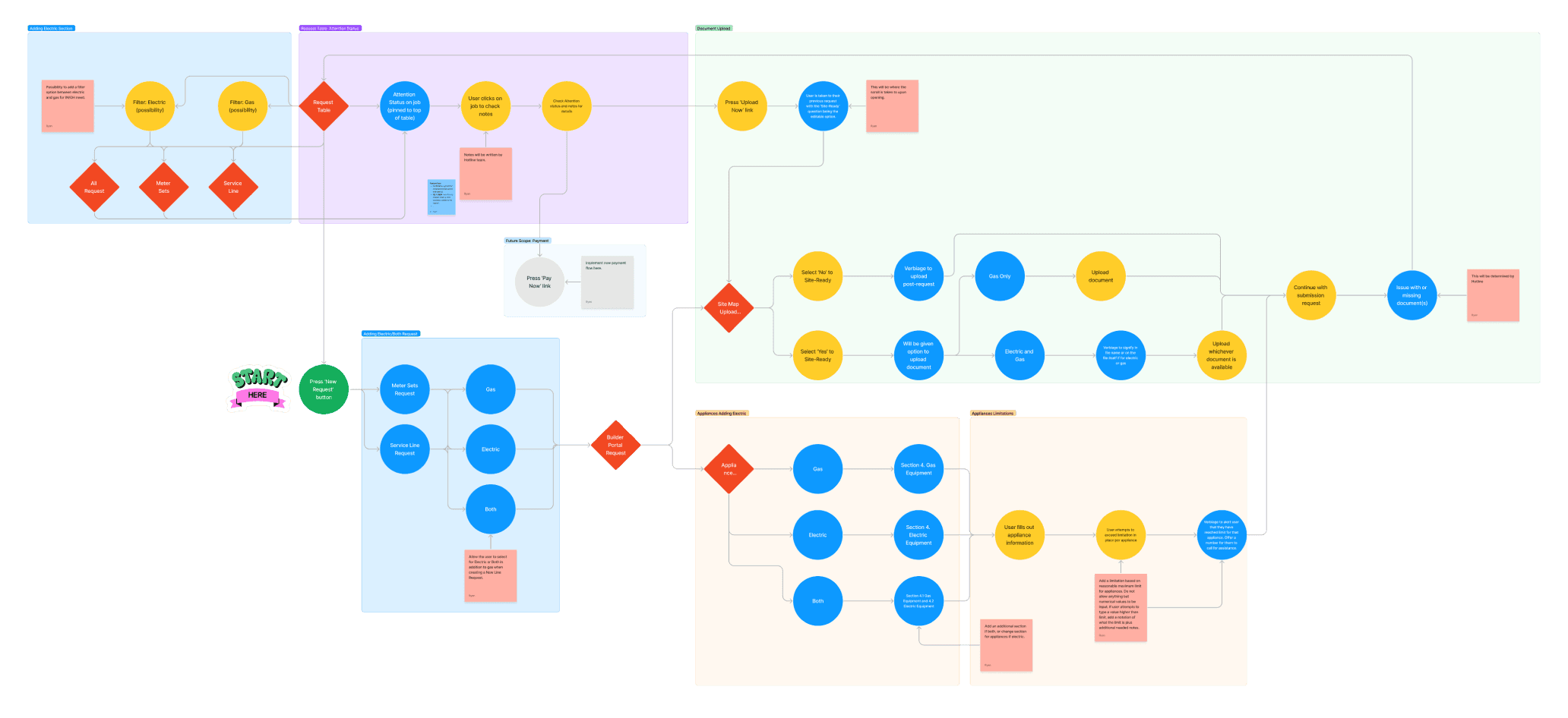
After identifying the core pain points through research and competitive analysis, I mapped the full experience from both the external builder’s and internal scheduler’s perspective. This ensured that our redesign wouldn’t just fix surface-level issues, but would create a cohesive end-to-end flow across user types.
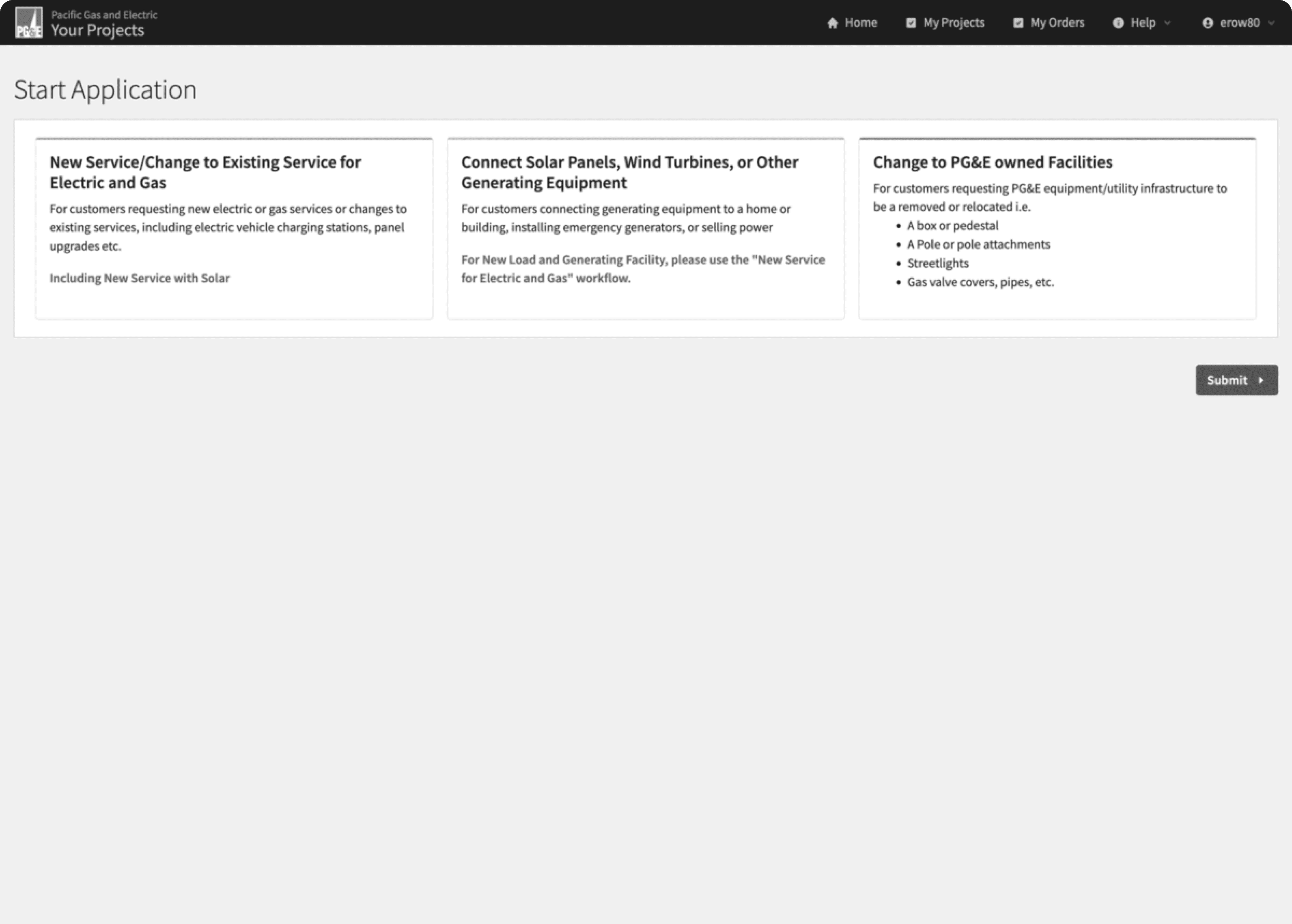
The builder’s journey began with selecting a region and service type, followed by a step-by-step request process tailored to their needs. Internally, schedulers would need tools to triage, prioritize, and assign those requests — all in a way that respected state-specific rules and daily bandwidth.
These journey maps informed the creation of low-fidelity user flows, outlining every decision point and screen interaction. This helped align our team, including stakeholders and engineers, on the direction before wireframes were produced.
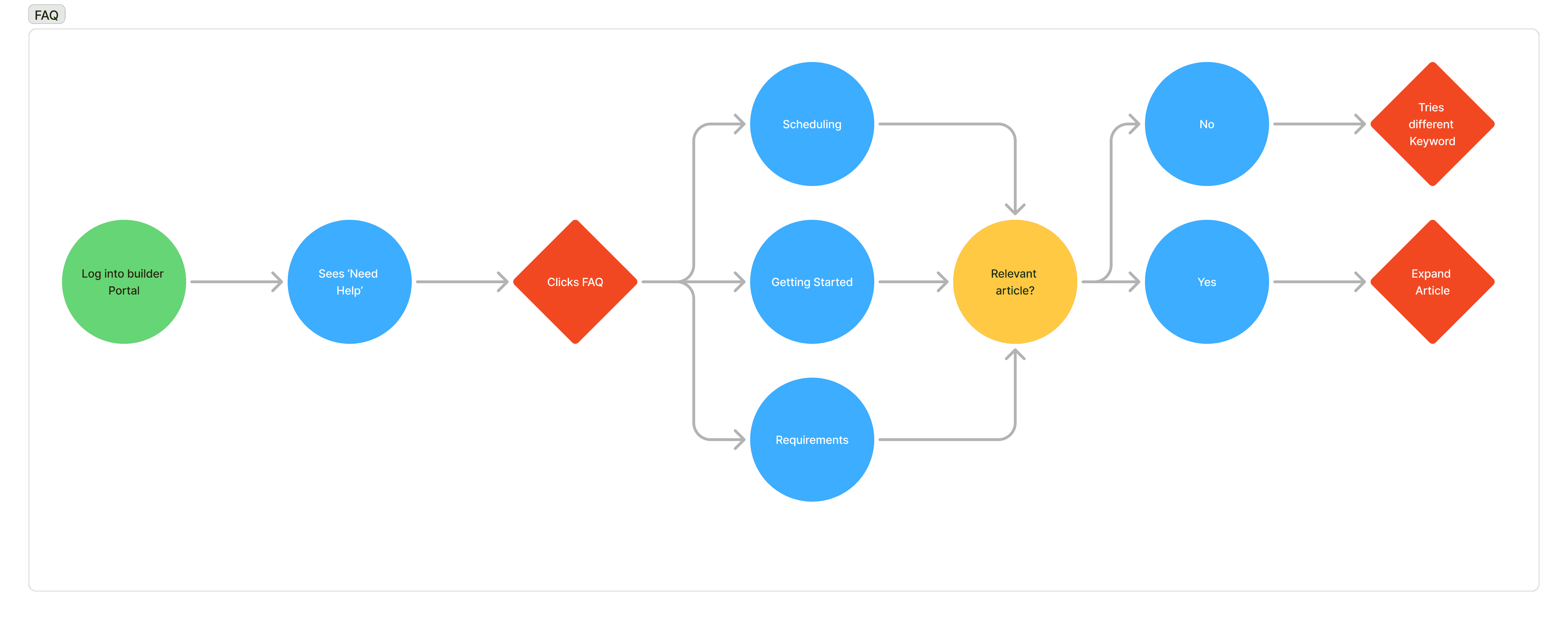
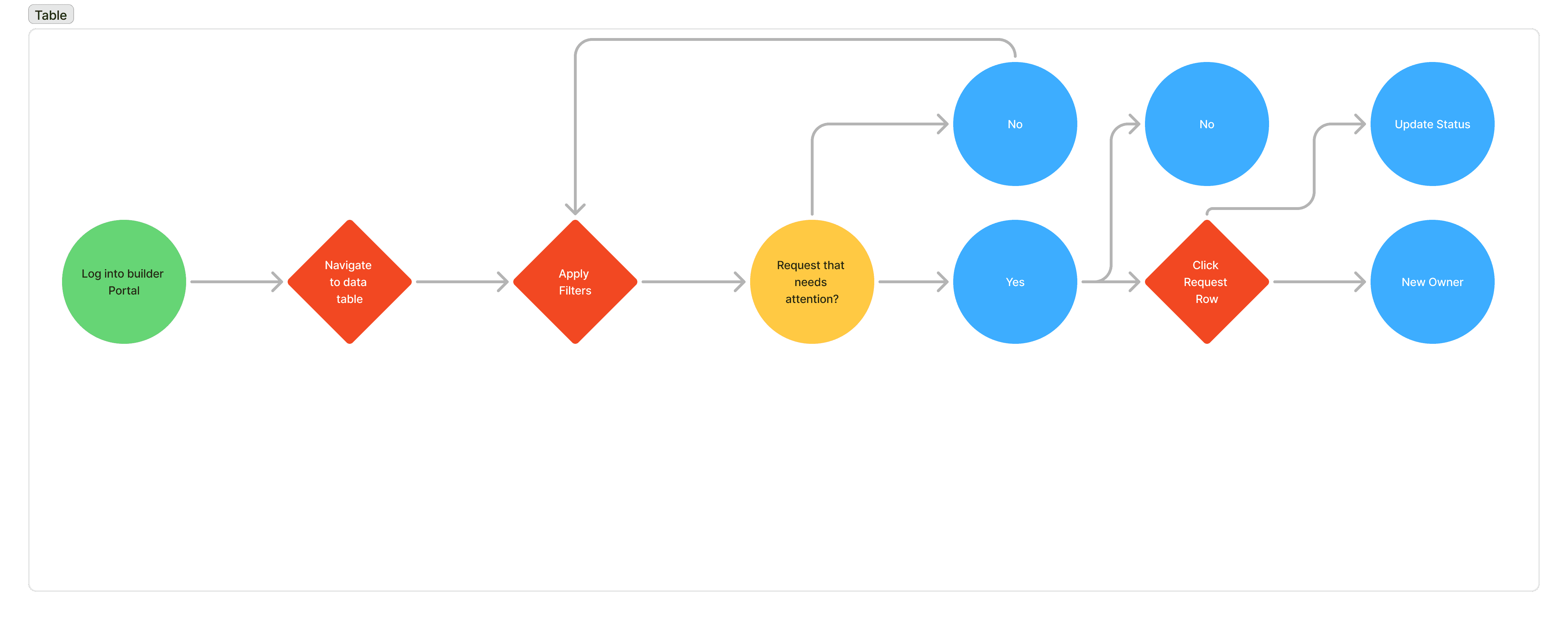
🔁 Key Flows Mapped
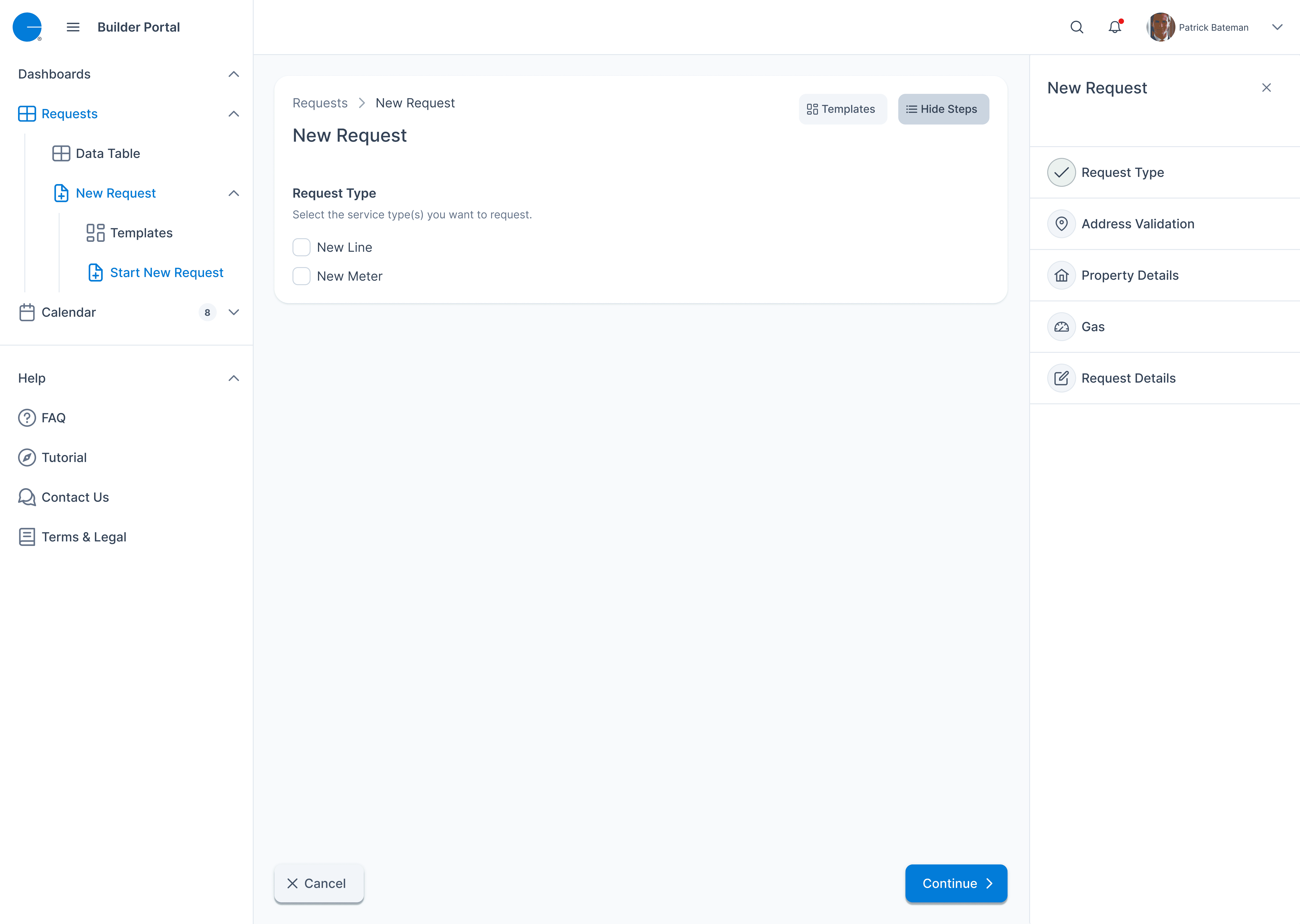
Segmented Request Flow: Guided builders through only the relevant steps based on their service needs and location.
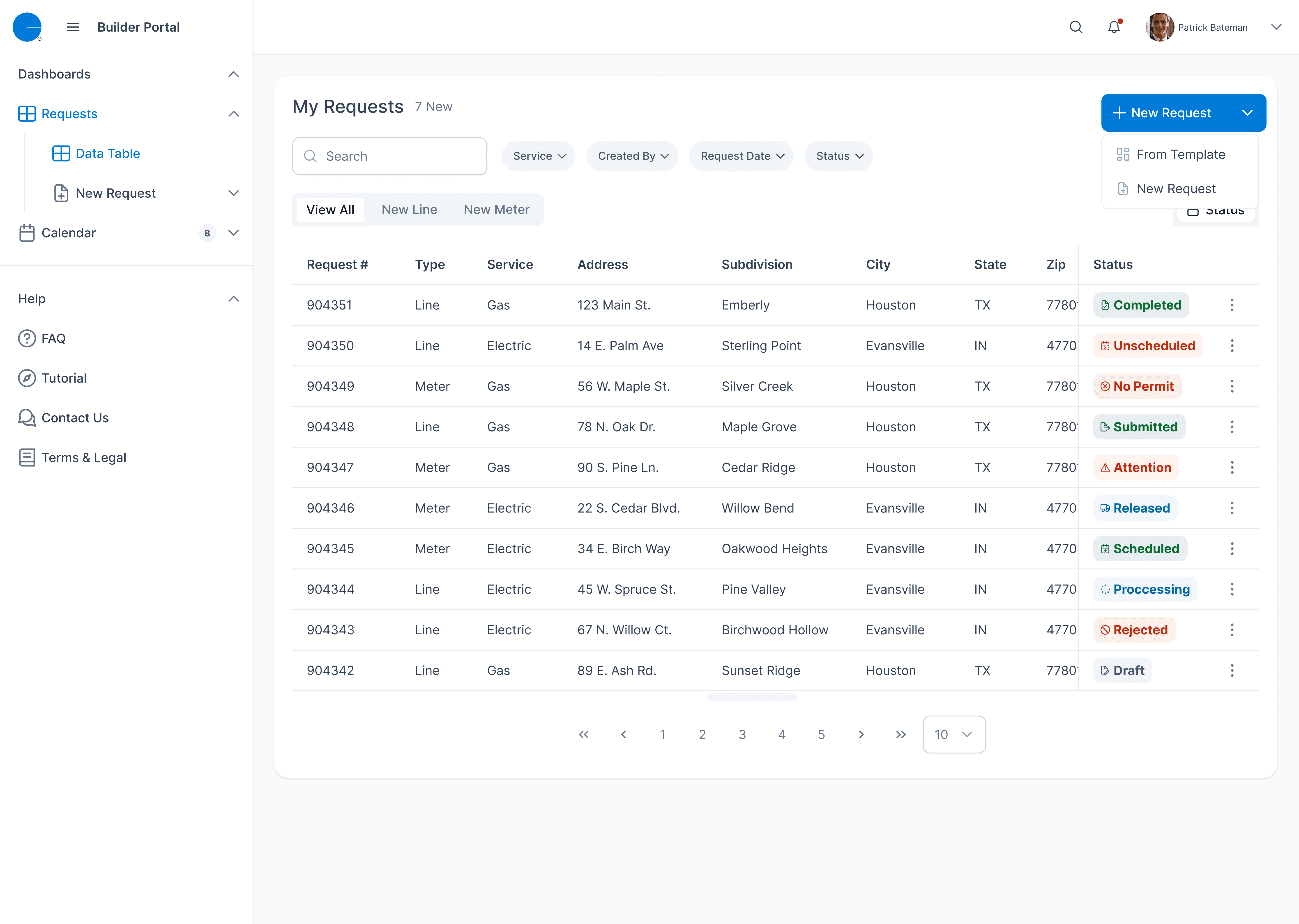
Dashboard Flow: Allowed schedulers to sort, filter, and evaluate submissions quickly.
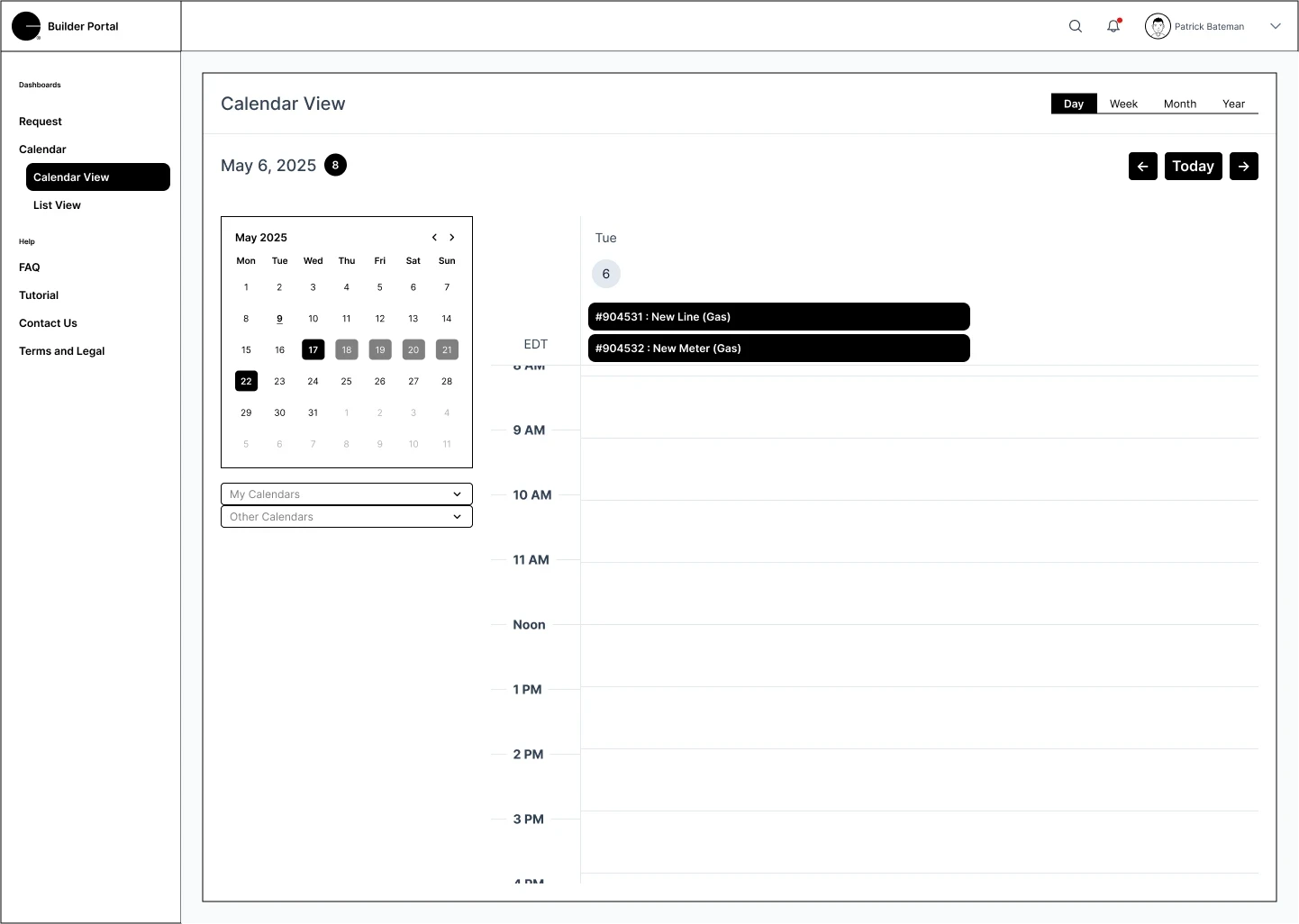
Calendar Flow: Enabled internal staff to view scheduling availability and assign requests without manual bottlenecks.
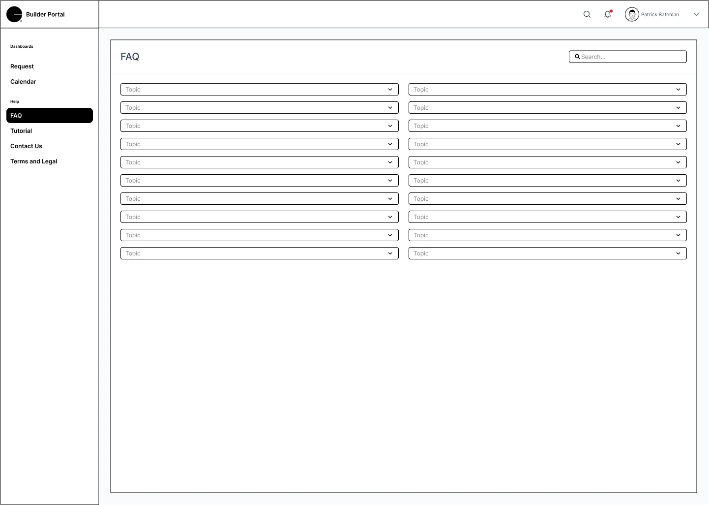
FAQ Access Flow: Provided contextual help throughout the request journey to reduce support tickets and confusion.
Each of these flows worked in tandem — not isolation — to solve a larger system-wide problem. Instead of just re-skinning the portal, we rebuilt it around real user behavior.

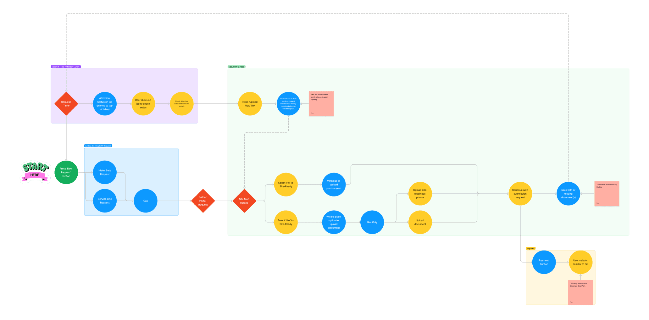
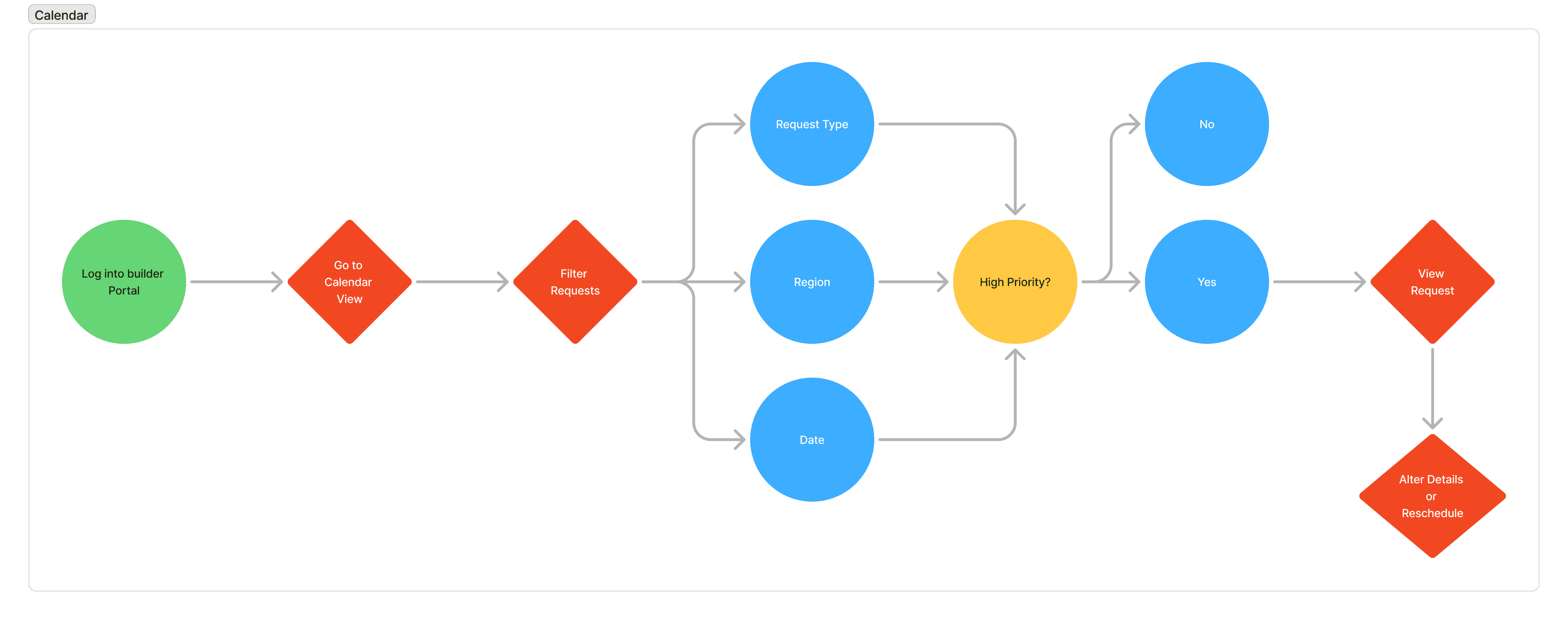
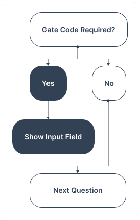
This logic diagram illustrates how the form dynamically adapts based on user input. For example, when a user selects “Yes” to “Is a gate code required?”, an additional field appears to enter the code. These conditionally triggered inputs reduced friction and improved data quality for internal form submissions.
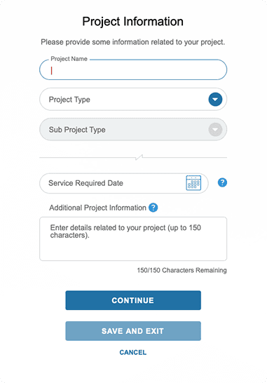
With the user journey mapped and validated through research, I translated the core flows into wireframes to visualize structure and test usability early.
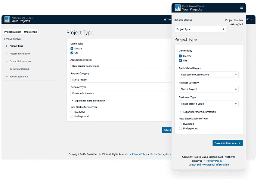
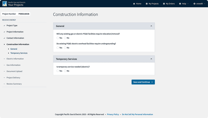
I broke down the builder experience into digestible steps — using clear headers, contextual help, and conditional logic based on service type and region. Internally, the triage dashboard wireframes emphasized clarity: quick filtering, regional tagging, and status visibility to support fast decisions.
These wireframes were tested with both external contractors and internal schedulers. Feedback was incorporated in quick iterations, helping to de-risk usability issues before high-fidelity designs were finalized.
🧪 What We Tested
Segmented request flows by service and region
Inline FAQ prompts and contextual instructions
Dashboard usability and filtering logic
Calendar interaction patterns for scheduling
🗣️ Feedback Highlights
“Now I know what’s required up front instead of guessing.”
- External user, after walkthrough of request flow wireframe
“This dashboard actually helps me triage, not just store submissions.”
- Internal scheduler, after seeing prototype of admin dashboard
By validating the structure early, I was able to confidently move into visual design, knowing the core interactions were solid.
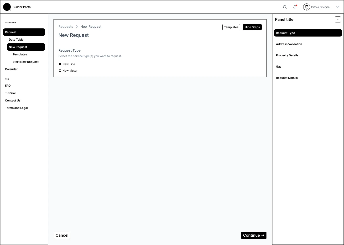

After validating wireframes through testing and feedback loops, I moved into high-fidelity design—bringing structure, polish, and system consistency to each screen across the Builder Portal. This wasn’t just a visual exercise—it was a critical opportunity to enhance trust, reduce confusion, and prepare the product for developer handoff.
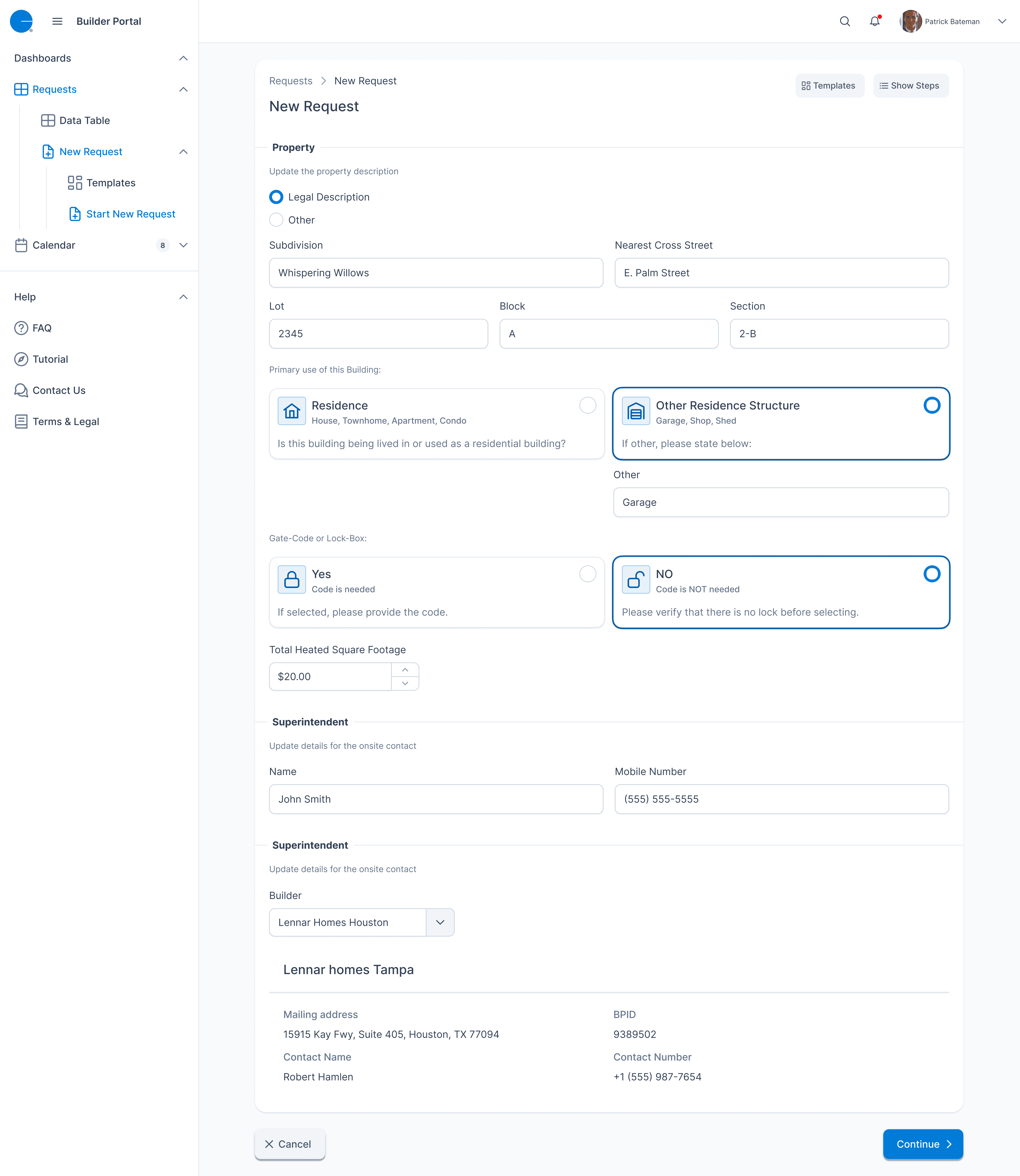
At this stage, the key challenge was balancing complexity and clarity. The request form spanned multiple sections, many of which were mandatory due to compliance or operational workflows. Rather than simplify by removal, I designed a progressive flow that focused on logical grouping, smart defaults, and real-time feedback.
🔍 Design Improvements
Address Validation
I introduced a clear modal for unresolved addresses. Users are prompted to confirm or correct information before proceeding—reducing backend errors and unnecessary resubmissions.
Save Progress Experience
Builders often stepped away from submissions mid-process. To prevent lost work, I implemented a “Save Progress” confirmation prompt, helping users re-engage without starting over.
Modular Gas Equipment Input
Rather than presenting a cluttered matrix, I broke gas service fields into expandable blocks with quantity pickers and dropdowns. Each line item is now readable and scannable at a glance.
Document Upload
Builders frequently attach PDFs or photos. I added drag-and-drop file support, inline previews, and status indicators (e.g., “Pending” or “Complete”) to build clarity around what’s required.
Final Submission View
Before submission, users see a full summary of their request, equipment, scheduling, and terms. This not only builds trust but reduces errors by giving them one last chance to review.
Scheduling UI
Rather than ask builders to guess, we now show available windows with visual time pickers—mapped directly to internal capacity rules from the ops team.
💡 Design Principles Used
Hierarchy over minimalism: I didn’t remove inputs—we gave them structure.
Anticipate interruptions: Save states were critical for long forms.
Confidence through feedback: Modals, validation, and previews gave users more control.
🖥️ Screens Included
Address not found modal
Save progress confirmation
Gas service quantity configuration
Final review screen
Service scheduling & document upload
Terms and electronic signature
These designs were built using the company’s evolving PrimeNG design system and customized components I created when system defaults weren’t sufficient. All patterns followed WCAG AA compliance, and spacing was aligned to a 4pt grid for internal consistency.
Feedback from internal stakeholders was overwhelmingly positive, and both builder-facing and internal service teams found the interface significantly more navigable and reliable than the legacy version.


↓ 40% form submission errors
↓ 30% support tickets
5-state rollout
Faster scheduling, less internal friction
"The new system actually helps us plan instead of just react. It saves hours every week." — Regional Scheduler Lead
The Builder Portal redesign was a deeply collaborative effort that pushed me to think beyond just UI updates. I had to balance regional operational complexity, builder usability, and internal scheduling needs — all within a system that hadn’t scaled in years.
If I were to revisit the project, I’d take two key next steps:
Introduce behavioral analytics
While we saw a clear drop in form errors and support tickets, adding analytics (e.g., drop-off rates, time to complete by flow) would help validate friction points and prioritize future iterations.
Build a two-way scheduling experience
Builders still submit requests without visibility into availability or status. A lightweight scheduling interface or builder-facing dashboard would close the loop and further reduce coordination effort on both sides.
This project reinforced how important it is to design for internal and external users simultaneously — and to treat scalable operations as a core UX problem, not just a back-office concern.