PRIVATE CONTENT

CenterPoint Energy
Senior UX Designer
Responsive Web
1+ Year
The team consisted of 1 Senior Designer (myself), a Junior Designer, 1 Product Manager, 1 Product Owner, 5 Developers, 1 QA and 1 Business Analyst.
Challenge
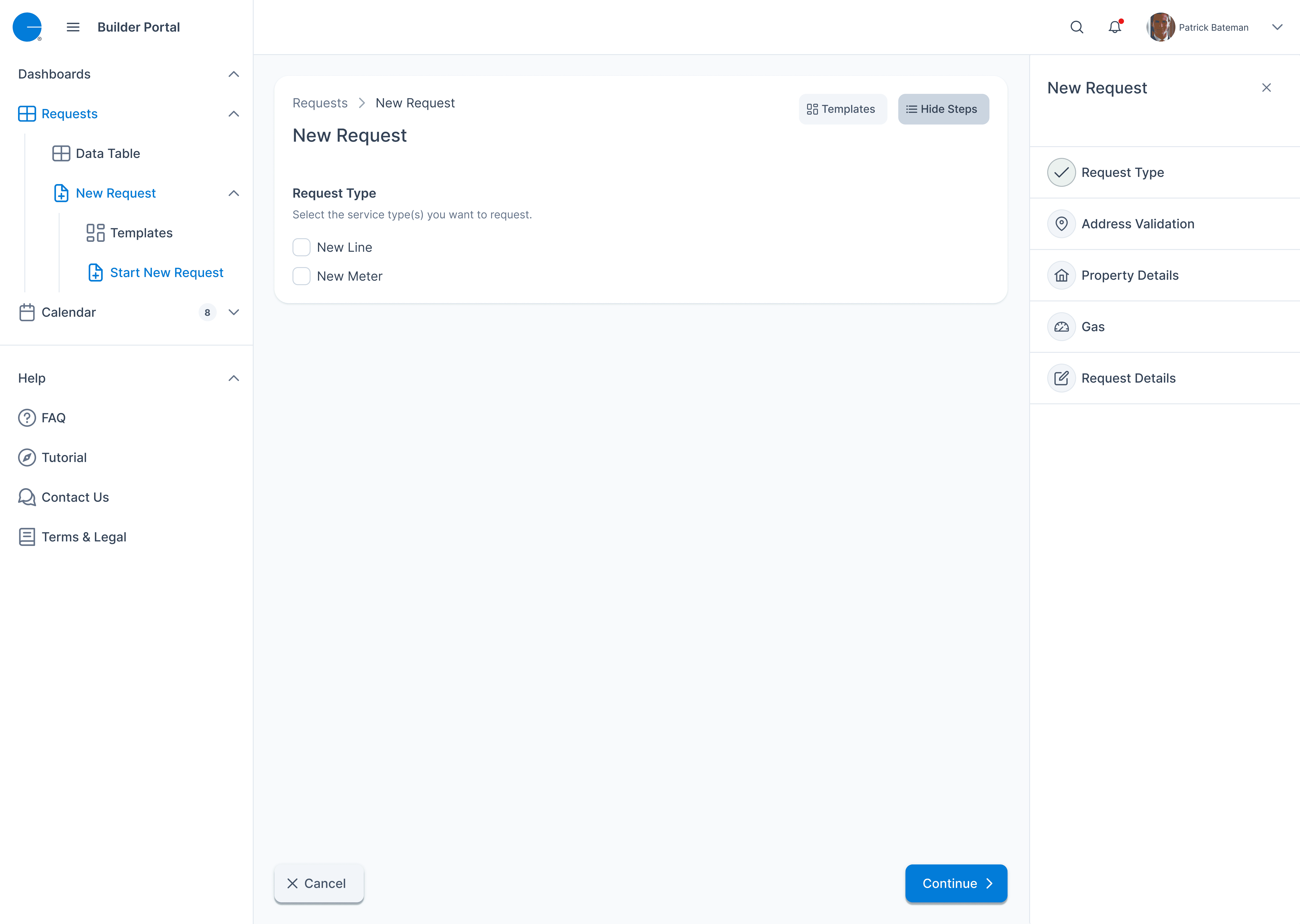
ClearPath was designed to help residential customers request gas services, but the experience was fragmented and confusing:
The request form was one-size-fits-all, failing to adapt based on service type or location
Users had no clarity on when someone would arrive, and support received frequent follow-up calls
Internally, customer service reps lacked tools to verify payments or respond to real-time needs
Worse, internal and external users shared no cohesive journey — customers were left in the dark, while agents had no visibility into the request context.
My challenge was to redesign the request experience from both ends, modernizing the workflow while solving deep operational inefficiencies — all without disrupting the utility’s strict compliance and regional rules.
ClearPath is a residential-facing tool used to request gas-related services such as shut-offs and meter changes. The experience was outdated, form-heavy, and didn’t adapt to different user needs. Internally, support teams lacked tools to verify payments or triage incomplete requests.
I redesigned the entire experience around user flow logic — introducing guided service selection, dynamic scheduling (with AM/PM and all-day logic), and a payment dashboard for internal teams. The result was a faster, more flexible request system that reduced user confusion and empowered internal staff.


Discovery & User Context:
We reviewed the existing customer scheduling flow and identified gaps in clarity for homeowners. The process lacked scheduling flexibility and service transparency.
User Interviews & Personas:
We interviewed residential customers and internal service agents to understand their pain points when requesting services like gas shut-offs and new meter installs.
User Flows & System Logic:
We designed parallel user journeys—one for customers submitting requests and another for internal schedulers handling follow-ups, payments, and confirmations.
Wireframing & Validation:
Wireframes included features like AM/PM selection, service type filtering, and address/account number logic. Prototypes were reviewed to validate clarity and flow.
Visual Design & Feature Alignment:
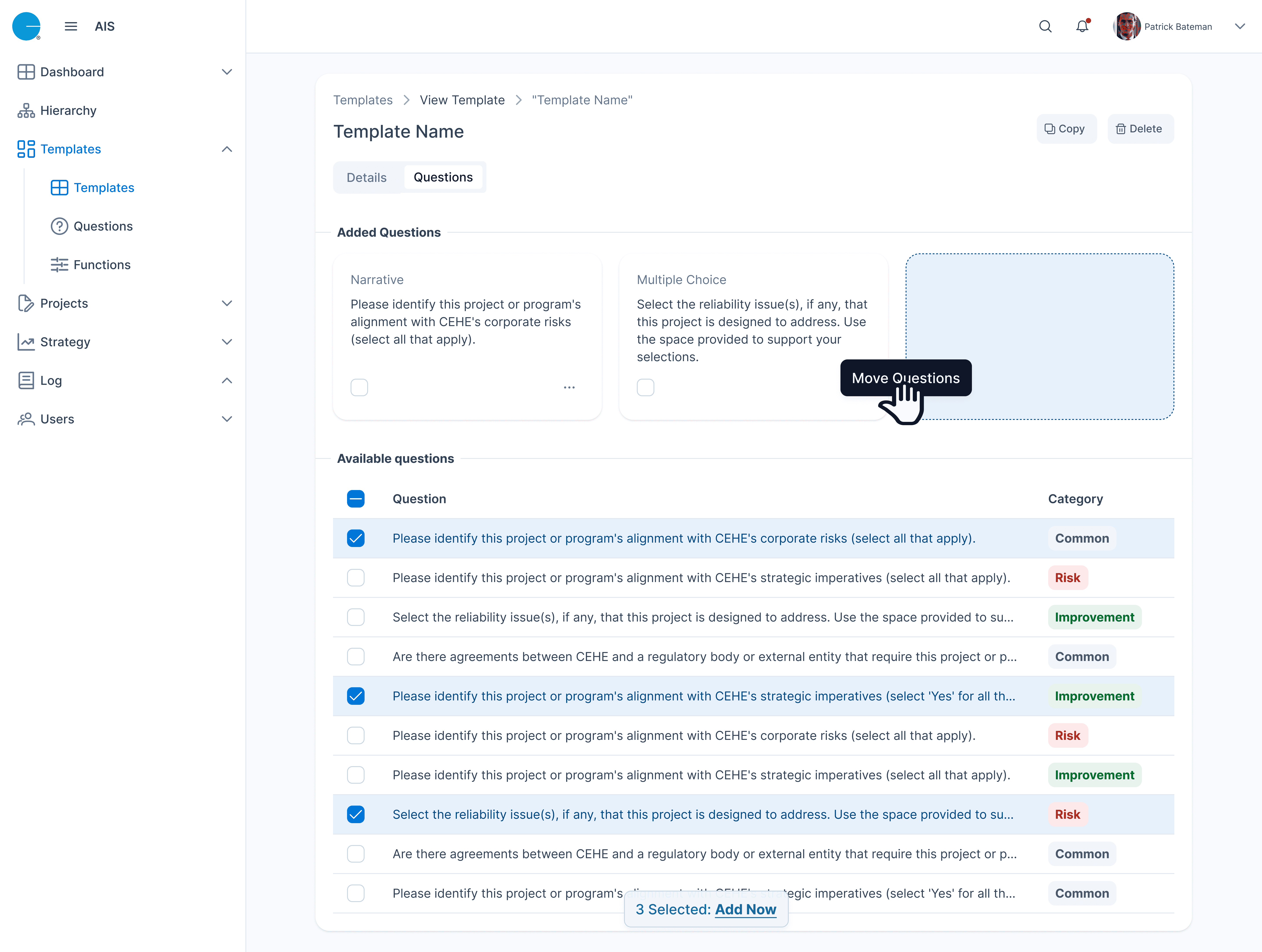
We implemented clean UI updates consistent with the Builder Portal while adapting for residential needs. We also built tools like payment dashboards and dynamic service selectors.
Results & Reflection:
The redesigned flow led to more successful self-service scheduling, improved internal processing speed, and reduced miscommunications between customers and agents.
ClearPath was intended to help homeowners request services like gas shut-offs, meter upgrades, and line removals — but it had grown outdated and confusing. I began the project by speaking with real users and internal stakeholders to understand where the experience was failing.
I ran short interviews with residential customers who had submitted service requests and with customer service reps responsible for managing those requests. My goals were to uncover:
Where homeowners got stuck or confused during the process
How internal staff handled incomplete or failed requests
What information or tools were missing on both sides
This foundational research helped me identify critical pain points early and ensured the redesign would solve real issues for both ends of the user journey.


I mapped the ClearPath experience from both perspectives: external users (making requests) and internal staff (verifying and acting on them). This helped identify breakpoints and led to a full rewrite of the flow logic.
✳️ Flows Designed:
AM/PM Scheduling Flow: Gave users flexible time options based on system availability
Service Type Flow: Allowed users to select multiple request types and auto-advanced based on selection
Payment Verification Flow: Enabled internal staff to track, filter, and resend payment links from a centralized dashboard
🧭 I built flows in FigJam and used sticky-note testing to verify logic before prototyping.


This diagram illustrates how ClearPath uses region, service type, and scheduling constraints to dynamically drive user options. Once a region is selected, only valid services are shown. Behind the scenes, service-specific rules are loaded — such as permit requirements, technician certifications, or job duration constraints — to filter available time windows. The result is a responsive scheduling experience grounded in complex business logic.

With research-backed flows in place, I translated key user journeys into wireframes. These focused on simplifying form inputs, guiding users based on service type, and capturing essential scheduling details.
For example:
The request flow now adapted based on the selected service, removing irrelevant fields
A dedicated time selection module was introduced to support AM/PM/All Day options
Internal user wireframes included dashboards for tracking payments and resending links
These low-fidelity prototypes were tested with stakeholders to validate structure, logic, and labeling. Feedback was used to refine layout clarity and surface edge cases early, before investing in high fidelity visuals.


Once wireframes were validated, I translated them into a unified visual system that aligned with our broader design system efforts.
Highlights included:
A refreshed, responsive layout optimized for residential users on desktop and tablet
Clear field groupings with contextual tooltips for uncommon requests
A modern, ADA-compliant color palette and consistent visual hierarchy
For internal users, a modular dashboard showed payment status and included quick actions to resend links
“This feels 10x easier — like someone finally thought through what we actually need to do.”
- Feedback from an internal service rep during UI review
The final UI brought clarity, accessibility, and logic to both ends of the ClearPath experience — reducing errors, calls, and frustration across the board.


The ClearPath redesign led to measurable improvements for both residential users and internal support staff:
40% fewer scheduling-related follow-up calls due to the new AM/PM logic
Faster request completion time with a guided, dynamic service flow
Drop in incomplete or misrouted requests, reducing internal triage workload
Higher usage of the payment dashboard among returning users, improving billing transparency
Feedback from internal stakeholders also highlighted reduced onboarding time for new support reps and fewer escalations from misclassified requests.
This project pushed me to think deeply about designing for two user groups with very different needs — homeowners who want clarity and simplicity, and internal teams who need precision and control.
If I could take the project further, I’d focus on two areas:
Integrating real-time scheduling availability
Giving users visibility into available slots would further reduce confusion and back-and-forth coordination.
Adding analytics to track request patterns
Internal teams could proactively identify demand surges and adjust staffing or workflows accordingly.
ClearPath reinforced that even “simple” public-facing tools can hide complex operational challenges — and that UX is often the bridge between the two.