PRIVATE CONTENT

Client:
CenterPoint Energy
Duration:
1+ Years
UX Design
UX Design
UX Design
UI Design
UI Design
UI Design
User Research
User Research
User Research
Less Calls to Scheduling
Less Calls to Scheduling
Less Calls to Scheduling
Less Calls to Scheduling
Faster Scheduling
Faster Scheduling
Faster Scheduling
Faster Scheduling
Increased Customer Satisfaction
Increased Customer Satisfaction
Increased Customer Satisfaction
Increased Customer Satisfaction
Details
Details
Details
Details
Problem Statement:
Business required a way to track scheduled appointments while also giving customers a better estimate on their service window.
Goal:
Create a scheduling system that is intuitive without adding additional time to the request process.
Target Audience:
External Users who are Requesting a Service
Before and After
Before and After
Before and After
Before and After
The initial UI used a progress bar on top and concentrated on massive negative space to help with responsive design.
The biggest changes to this product were:
Updating the UI to match other products for this client.
Creating a more intuitive date selection flow for a quicker way to select far off options.
A scheduling time-block for an estimated service window.

Initital Interview
Type:
External User
Context:
Discussing the experience of scheduling a utility service.
Role:
Homeowner scheduling a gas meter upgrade

Initital Interview
Type:
External User
Context:
Discussing the experience of scheduling a utility service.
Role:
Homeowner scheduling a gas meter upgrade
Initital Interview
Type:
External User
Context:
Discussing the experience of scheduling a utility service.
Role:
Homeowner scheduling a gas meter upgrade
Initital Interview
Type:
External User
Context:
Discussing the experience of scheduling a utility service.
Role:
Homeowner scheduling a gas meter upgrade
Key Takeaways
Key Takeaways
Key Takeaways
Key Takeaways
Date Selection
Expectedness is Key! Create a flow that is intuitive
Extend the selection beyond a week. Allow users to filter the search by month (default) into year
Guardrails
Information inline-alerts will help the user understand certain choices, but only after they select those choices.
Be specific in wording. "All Day" must mean all day, and AM/PM need specific times for users to understand it's begining and end time
Inital UX Wireframe
💡 Solution
The new scheduling experience allows customers to:
Choose a preferred time window
Get a clear disclaimer when selecting “All Day”, letting them know a technician may arrive anytime between 8am–5pm
Enter or confirm their contact number for updates or coordination
This reduces friction and builds trust by giving users more control and transparency during scheduling.
🗣️ Feedback
✅ “Finally, I don’t have to wait around all day wondering when they’ll show up.”
✅ “The AM/PM option is helpful for planning my work-from-home days.”
🛠️ “Could we eventually show estimated arrival time ranges based on technician routing?”
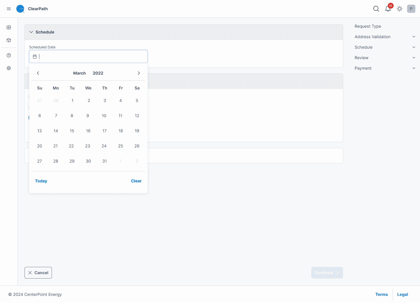
Date Picker
This redesigned date selection component replaces the previous scroll-based selector with a traditional calendar-style date picker. The change was made to enhance usability and reduce friction during scheduling.
🧠 Problem
In the earlier design, users were required to scroll horizontally through available dates — often seeing only one or two options at a time. This created several issues:
Slower navigation when scheduling several days or weeks out
Frustration due to lack of visibility into the full month
Higher risk of accidental selection due to rapid scrolling
💡 Solution
The new calendar-style picker provides:
Full month visibility at once for faster, more confident selection
Clear labels for month and year navigation
Quick actions for “Today” and “Clear” at the bottom
Keyboard accessibility and better compatibility with desktop users
🗣️ Feedback
✅ “Much faster — I can actually see all the options at once now.”
✅ “The old one was annoying to scroll through, this feels more like how a calendar should work.”
🛠️ “Could we eventually highlight blackout dates or preferred ranges based on availability?”
Time Slot Selection with Contextual Alert
This iteration of the scheduling UI enhances transparency by pairing AM/PM/all-day time slot selection with a real-time alert that informs users of what “All Day” actually means operationally.
🧠 Problem
Users often selected “All Day” without understanding that their appointment could occur anytime between 8am–5pm. This led to:
Missed appointments due to misaligned expectations
Frustrated users expecting more precise time windows
Increased call volume from users seeking clarification
💡 Solution
The new design introduces:
Three clear time slots (8am–12pm, 12pm–5pm, All Day)
An informational alert message that appears only when “All Day” is selected
Language that proactively sets expectations:
“By selecting all day, this can result in anytime from 8am to 5pm.”
This lightweight contextual feedback helps manage expectations without creating friction in the scheduling flow.
🗣️ Feedback
✅ “I like that it tells me exactly what to expect — I won’t be guessing all day anymore.”
🧪 “Great use of conditional UI to avoid cluttering the interface unnecessarily.”
🛠️ “Could we eventually add tooltips or info icons for the other time windows too?”
Other Projects
Other Projects
Other Projects
Other Projects
© 2025. All rights Reserved.
© 2025. All rights Reserved.
© 2025. All rights Reserved.
© 2025. All rights Reserved.